
LET’S DANCE
programs used : photoshop. illustrator. lots and lots of indesign.
time frame: under 3 weeks
SHOWSTOPPER is one of the largest dance competitions in the United States, and the competitors who have particpated in it have gone on to perform on the world stage. Britney Spears. Mandy Moore. Nick Carter. Lance Bass. Jennifer Lopez. “B” herself, Beyonce. The list could be mistaken as a who’s who for pop culture, and has the makings of a somewhat bitchin’ (throwback) Spotify playlist. So, when I was brought in as Head of Design to help conceptualize a new, modern look for the brand it was exciting and daunting. As progressive, cutting edge and dynamic as the acts competing for their prizes were, some of the materials that were representing Showstopper didn’t exhibit those elements. They were aware of this and one of their major concerns was their Finals program. With an install base of 30,000 the programs for Showstopper’s events were a huge part of their business. Families purchased the programs as keepsakes and mementos, and the revenue stream from the sales was equally as important. That’s why there was concern over the program which was nearly finished yet hadn’t been sent to print. Let’s take a look.


Yikes. Don’t let the looks decieve you, this program is not from the early 90’s. It’s not even from the 00’s. This is 2016. I swear. We can carbon date it. Jokes aside there were major issues with this including composition, typography, legibility, and color schemes. It felt disjointed and muddled. Worse it was hampering the subject it was supposed to be highlighting; the dancers. My first task with my new role was to re-configure it. The timeframe: A little over two weeks. Because the date of the Finals was obviously set, and due to the large scale nature of the print, the window to try to change the project was small. There wouldn’t be enough time to schedule new photography and compose it in time. The dancers that would be needed to do so were already paricipating in the competition on the road. This meant I would have to rely on the assets that were already on hand. I couldn’t shop for new ingredients. Instead I’d have to make a new dish, a better meal, with the same ones. Thankfully the cupboard wasn’t bare. Let’s see what I cooked up.

The first major decision I made was to change the program’s form factor. Turning it on its side introduced a landscape layout. Going through the photo selections for the program, along with the archived ones, showed that most of their photography favored this viewpoint, which made sense since dynamically crossing space is a large part of a dance performance. The old program’s layout caused all of those photo assets to be framed horribly, leading to cut off limbs and extensions while removing any sense of scale. The idea was to let the new format highlight the dancers and their movements. Showstopper already had a color scheme, it just needed to be modernized and implemented to give the program cohesion. I lightened the palette removing the blacks and darker shades for more vibrant tones instead. Something punchy and energetic as opposed to the moody, heaviness from before.


Another key point the owners were disappointed with was the state of the calander. Serving as an important road map to future dates, the calander’s dates were featured on their website, but they also wanted to reinforce it through their major print works. Leveraging the new layout along with color blocking, I transformed the calander from a page that was easily lost, to a highlight as a splashpage.

Here it is before.

The same treatment was given to the lists of Judges, Hosts & Announcers. The page became more organized but subdued, because honestly parents were there for their dancers, not god damn Julian Thorn (Though Julian was amazing. It’s all love.)


And after. Snazzy.

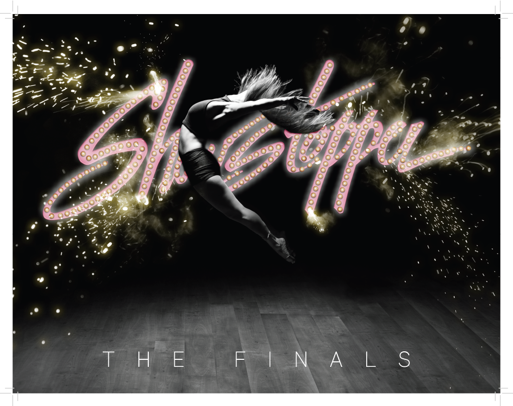
Finally, I brought some drama back to the program with its cover. While I couldn’t schedule the cover shot I had in mind, stock footage is always a designer’s friend. Some simple photoshop melded the dancer with the dance floor, and I went with a black and white look to give it more gravitas (also less hassle compositing considering the time frame). The marquee with it’s exploding lights was whipped up in Illustrator before given some enhancements in Photoshop.
Despite the truncated time frame limiting the amount of proofs that could be done with the printer, and having to rework the innards entirely because of the format change, the project was completed on time. But here’s the kicker; it went on to sell 3x more copies than any other program in their history. Customers were drawn right away to the format change, making it feel and look like nothing before it. The more sophiscated cover and interior really made it feel like a “Finals” program.
