
dial up
programs used : illustrator. capcut. Photoshop.
time frame: 1 week
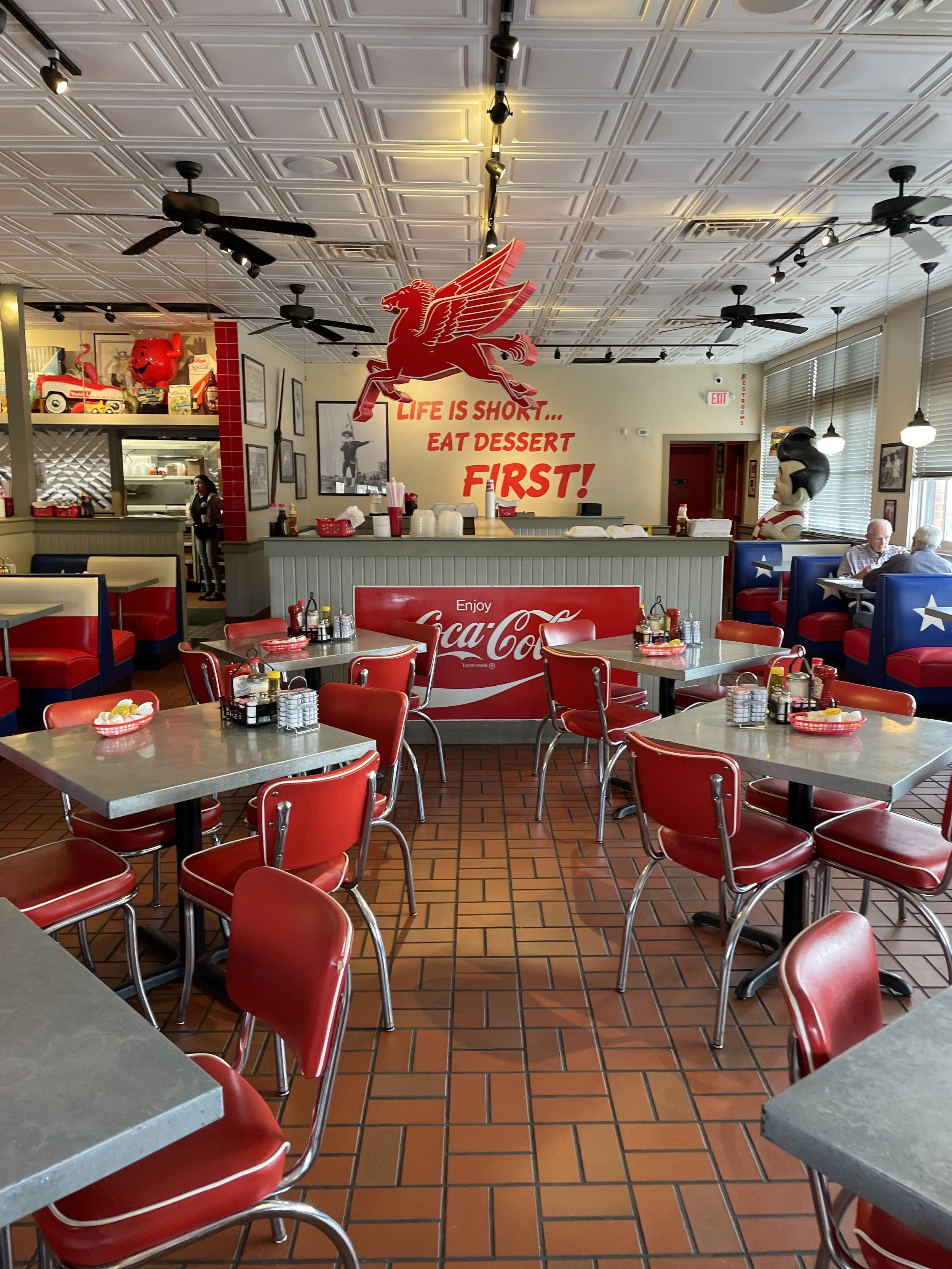
Everyone has some food joint they hold in irrationally high esteem. Even the most even keel person you know, the one that laughs off an obvious insult, or tells you they can “agree to disagree” during political and philosophical debates, has a special box of insanity they will break open in the emergency situation of you disagreeing with their choice of pizza place. (I’m not even keel so I’ve almost shanked someone who thought that my choosing LaVista Pizza on 2nd Ave over Artichoke was some “contrarian” hot take). Whether it’s a diner, drive-in or…well, I won’t finish that since I’m not sure how extensive Food Network’s trademarks are. Point is, we have a loyalty to the food we like and the places that we think make that food best. That doesn’t change in Texas. If anything, as the old axiom would imply, it’s even bigger in Texas. Norma’s Cafe is an institution there. When you step inside some of them it’s not hard to see why. I mean look at this.
It looks like Marty McFly is going to bust in any second. Then Quentin Tarintino is going to explain how he fucked up the timeline before shooting him.
Despite being a mainstay for locals to gather and have Riverdale-esque moments at, Norma's never had a way to order online. Not even during COVID, which it actually thrived through (That makes sense, though. If ever there was a period of time to self-medicate with a hamburger and fries to the face, it was then). If you wanted their signature breakfast or needed a special spread for the winning team, you had to call and pick it up yourself. So the food was classic American fare, but the way to get it was practically draconian by modern standards. They thankfully solved all that by creating an app. Having an app means getting the word out about it, so they wanted some social media content that could get people excited about its debut. I drew inspiration from the fact that they had never been on the internet in this way before. It made me think about what ordering from Norma's would look like in some alternate timeline. Maybe right at the outset of AOL. The project had a super short timeline because many companies focus on making something, and only remember they need to advertise that something towards the end. Because of this, I knew not to overcomplicate the idea, and to make sure that the assets needed to make it happen were easy to gather or could be straight-up created by myself. The first thing I knew I needed to whip up was a replica of that classic dial-up screen some of us were “blessed” to experience. No need for the “Way back machine” for this one.
Some of you can “hear” this image. But it’s too clean right? Let’s un-4k it.
Aw yea! Now that’s what I’m talkin’ about. Vaseline clarity.
It’s only a landing page but all of those assets were created in Illustrator. I didn’t download a pack or stock images. That’s not a flex, it’s more about the fact that I’m big on recycling content and assets. Using them in different formats and ways, either in conjunction with a new piece of content (as in using elements from a piece of content to promote it) or for future use in some other way. Maybe a whole other project. It’s great to have the ability to reach back and have something like the AOL mascot running from a burger at the ready.

Next up, I created the “never existed” Norma’s Online landing page circa 1998. The background for this was just a simple photo of their menu I took with my iPhone. Then Illustrator stepped in to create the retro “Gates Corp. Ancient Internet Explorer”. Ah, corporate blue and gray, amirite? Gets you right in the feels. Some blur effects were stacked on top to pixelize the whole thing. This is also an example of what I mean by re-using assets. I turned this same image into a simple ad by using more of the original photo and removing the “web browser” from the top.

Again the assets are minimal because the star of the show is the app itself. I took footage of navigating the app to showcase the ease of use and speed. This would make up the bulk of the ad. The last step was to edit the elements together in Capcut. Given the project, it made more sense to use it for editing. The presets allow for faster exporting to different social platforms which makes my life easier and gets the content out quicker for the client. Also, it has some cool effects that played well here. Let’s see the final cut.
That sound is going to be with you the rest of the day. You’re welcome.
Aside from some light editing and copy requests, there weren’t many changes on the client’s side. That helped move things forward quickly. To me, this was a great example that you don’t need a ton of assets to create something creative, unique, and engaging. Having that is always ideal, but in the end, a clear vision and idea will get the most out of whatever you have on hand. I’m going to go order a burger now as a reward.